Visualizing Yourself through Space & Time
 click to show full size
Thanks to Ernesto, for reminding me to share this!
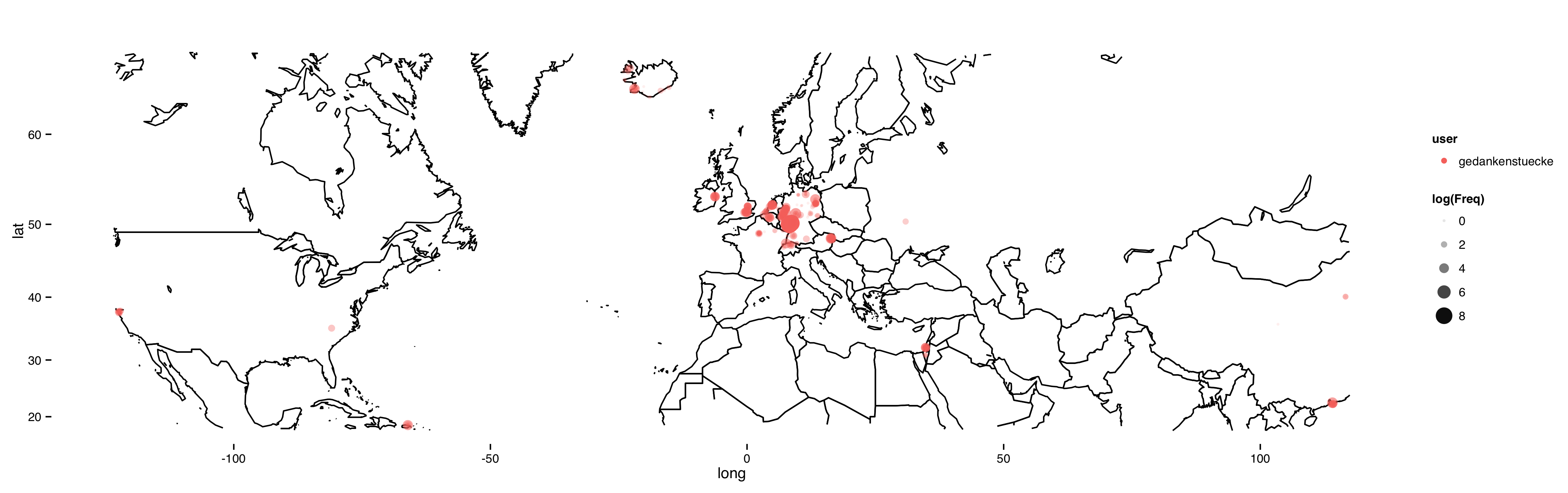
What you see above is where I have been over the last couple of years, at least according to two different data sources: Twitter and Swarm/Foursquare. I have been using Twitter since 2008 and started using their geotagging feature from the start (~2011 if I remember correctly) and I started to use Foursquare at least sporadically in 2010. In total that makes around 20.000 tweets and checkins which I can place on a map.
The above map just shows you how much I have checked in/tweeted from which locations. In order to condense the data a bit, and to show how much time I spent in larger areas, I decided group nearby tweets/locations. For this I just rounded the latitude/longitude to 2 digits. And I decided to plot the location frequency as the logarithm, because otherwise the places I’ve called home over the years would just dominate the map.
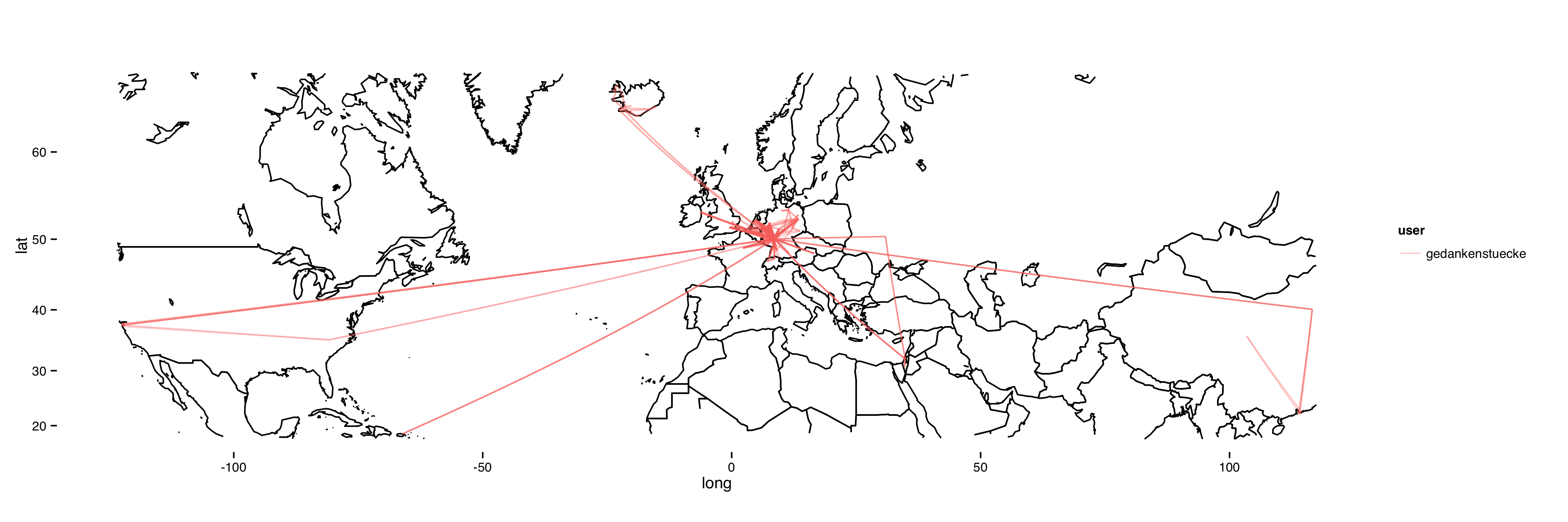
But there’s more that you can read from the data, you can of course also track my movement by just connecting the checkins in the order in which they happened. Which can be done pretty easily as well.
 click to show full size
For this there is a line drawn between each checkin and the next one. Or at least that’s how it supposed to work in principle, more on this below. In any case, you can see how I travelled to and through the US, Puerto Rico, China and other countries. For my trips to Israel you can even see the difference between taking a direct flight and having a layover in Kiev.
So, what about the problems with the data: For now I just used the connections given by the order of the checkins, which can be a bit misleading for two reasons:
- I’m not 100% sure that the order really reflects the chronology of the checkins
- I’m merging Swarm & Twitter geotags, but I’m not recalculating the connections between the two data sets. So each line is always between two points in a given data source.
- Posting geotagged latergrams on Instagram can put a new geotag into Swarm and Twitter, making it seem like I jump back to a place I was a couple of days ago.
Nevertheless, I think this is a nice and rather easy way to look into the geodata I’m creating each day. If you want to run this on your own data, the code for this is on GitHub and requires Python (for the data export) and R (for the visualization).
The code already has some support to visualize the data of more than one person. So if you want to plot your best friends data alongside yours, go ahead! And if you want to improve on the code, please: go head and give me a pull request.